The earliest known alphabet dates back to 600 BC written in Old Latin script. It later transformed into Roman capitals carved on walls and stones. The Roman cursive was used for sentences or long messages which developed into uncial letters during the 3rd century and became known as Calligraphy.
It was not until the rise of the manuscript period during the 10th century that hand written text had a huge demand. There was the influx of information in astronomy, botany, anatomy of the human body, medicine and specialty herbs. The task of handrwiting, copying and illuminating these manuscripts were dedicated to monastic scribes whose initial duties were copying the Sacred Scripture. Ink and brush on vellum or parchment paper became their canvass for creativity.
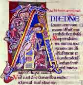
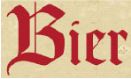
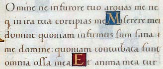
Scribes wrote cursive letters leaving a big space for an “illuminator” to fill in with paint or ink. This style was given the name Blackletter script. It was used throughout Western Europe from 1150 up to its decline in the 17th century. The German language continued to use it until the 20th century. The Blackletter was ridiculed by the Humanists calling the script "barbaric"and described it as Gothic
With the arrival of print in 1470, the manuscript culture began to fade away. But the manuscript style with illumination was retained and became exclusive use only by the nobles and royals for their special occasions like royal births, weddings, or procclamations and other special announcements.
The letterpress eracame in the mid 15th century. A lead alloy called Linotype was used to manufacture type which paved the way to the metal movable-type printing press.
The Italian Humanist miniscule script was invented by Rennaissance humanists who obsessed with the revival of antiquity. Modelled after the Carolingian minuscule from the early 800s, they described this script as a “litterae antiquae”or the "ancient letters" referring to ancient Rome. The look and feel of the humanist manuscripts was intended to suggest the contents of the text.
This style became the basis of our modern lowercase typefaces.
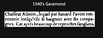
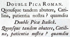
In 1540the Garamond typeface emerged, created by a French type founder, publisher, punch cutter, type designer Claude Garamond. He was commissioned by King Francis to cut a Greek typeface for book printing. Later he designed variations of his typeface which then became the standard in the 1600. Today, it is still one of the most widely used font.
In 1734 a British typefounder, punchcutter and designer, William Caslon created the Caslon roman and italic typefaces. They were distributed throughout the Bristish Empire and its colonies. The typeface later became popular throughout Europe but Caslon fell out of its popularity in the late eighteenth century with the arrival of transitional types like Baskerville and Didone.
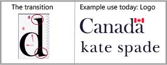
A serif typeface influenced by Caslon style was created by John Baskerville in 1757, a British type designer, writing master and printer. Baskervilleis a transitional typeface with increased contrast between thin and thick strokes resulting in sharper serifs.
It was commonly used in book design until other similar typefaces were created as inspired by the Baskerville design.
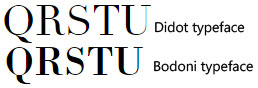
1780- 18th century. Didone is a genre of serif typeface that was popularized in Europe by Firmin Didot (Paris, France) and Giambattista Bodoni (Parma, Italy).
The Didot family dominated the type foundry in France and owned the most renowned print shop. The Didot typeface is known for its extremely thin hairline strokes contrasting with its thick stroke and the serifs are flat and unbracketed. It is defined as the Modern style and today it is commonly used in advertising headings, displays as well as magazine brand logos.
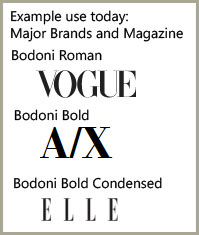
Giambattista Bodoni was influenced by Baskerville and Didot typeface designs. He created another serif, the Bodoni typeface which is similar to Didot but increased the contrast of the strokes making the body and its serifs look crisp and more defined. Earlier versions of Bodoni typefacewere considered “transitionals” and the later versions as “modern”.
Bodoni was considered to be more effective in modern printing. It was commonly used in headings, displays and magazine prints. In Europe, it was also commonly used as body text.
19th Century rise of the Slab Serif- This typeface is characterized by thick and block-like serifs. It originated from Antique Typeface, the first slab serif created in 1815 by a British punch-cutter and type-founder Vincent Figgins. It was thought of as ridiculous at first, but soon many versions of geometric slab came about. Some recognizable slab serifs are French Clarendon and Courier.
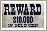
Late 19th Century - French Clarendon typeface is an alteration from several revivals of the Clarendon typeface which was initially published in 1845. The French Clarendon typeface has enlarged block serifs at top and bottom while the letters remain narrow. The intention was to grab attention as a novelty display rather than using it for body text. Although it was tagged as a “typographic monstrosity”. It was used worlwide but mostly associated with the wild west movie titles and posters, circus and wanted notices.
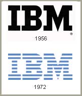
In 1955 IBM commissioned Howard Kettler to design a typeface for a typewriter. He created the Courier typeface. This was later redrawn by Adrian Frutiger for the IBM Selectric typewriter. IBM released the typeface to the public completely royalty free. It became the most popular typeface throughout the 30-year typewriter era. It became the standard choice in top secret documentations, telegram messages and general office correspondence at that time.
1964 The first digital font DigiGrotesk was produced by Rudolf Hell. He was the German inventor of the first digital typesetter called Digiset. The machine digitally assembles typefaces by bitmaps, also called "raster" fonts, which are built from dots or pixels forming the image of the glyph.
1975 The first Personal Computerarrives.
Steve Jobs partnered with Adobe to create a PostScript application for the Apple LaserWriter.
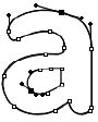
1985 - Apple LaserWriter was the first printer to ship with PostScript programming language, PostScript Type 1 font. The font was scalable to all glyph sizes using a mathematically defined Bezier curve.
Adobe licensed PostScript to Apple. A third company, Aldus, joined the partnership and created an application that utilized Macintosh and LaserWriter with a software called PageMaker.With the combination of the LaserWriter, PostScript and PageMaker, the Desktop publishing revolution began.
Sale of the Macintosh soared tagging along sales of Postscript and PageMager. However, Adobe took advantage of the opportunity and sold PostScript Type 1 font at exorbitant rates to publishers with Macintosh computers.
In 1989, Apple partnered with Microsoft to create an alternative font to counter Adobe's expensive fonts. TrueType font was released with the launch of Mac System 7 in May 1991. It is the first OS to work without any bitmap fonts. TrueType font used quadratic Bezier curves as opposed to PostScript’s cubic Bezier curves.
This period marked the rise of font designs.
In early 1990's Microsoft failed to get an agreement with Apple to license its advanced typography technology, the GX Typography. So Microsoft turned to Adobe for partnership to develop a new font format. PostScript and TrueType formats were merged and in 1996 OpenType (.otf) font format was released. OpenType is a registered trademark of Microsoft Corporation.
The new format included advanced typesetting features like embellishments allowing for ligatures and alternate characters. It created flexibility for designers opening a whole new game for graphic design.
The reign of Helvetica - developed in Switzerland in 1957 and originally called Neue Haas Grotesk it was renamed to Helvetica in 1960. Towards the 20th century, Helvetica became known as the Swiss style trademark in the world of typography. The modern san serif design's emphasis is on clean, assymetric layouts which became associated with architecture, photography and art. Most often the text itself is used as the graphic piece. It became the default among governments and businesses.
Use of Helvetica Today


Helvetica inspired other designers to create variations of its style. Fonts that came about were Arial, Verdana, Myriad, Futura and Univers to name a few.
Other typography designs have emerged since then adding more choices in the categories of serif, sans serif, slab serif, decorative and script.